These may be simple and obvious ideas for many educators and curriculum directors. However, for me, these are a few of the things I’m beginning to understand better when it comes to designing e-learning experiences and in particular iBooks Author content.
LESS IS MORE
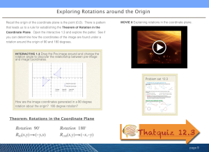
An earlier page out of my iBook contains several tasks with the following elements on one page: text, defined terms, an interactive directed towards discovering the rules of rotations, a video to watch, a sheet of homework, and a link to our online quiz site. In addition to the content there is also the blue bars on the top and bottom of the page.
Does this seem like a bit much? Overwhelming to look at? Confusing? Wondering where to begin and what to take away?
Take 2
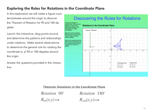
This page from the same section of a later edition contains only one task along with text, defined terms, and the interactive directed towards exploring the rules of rotations.
This may seem obvious to designers but to the everyday teacher it takes a bit to step back and recognize the mess we are creating when we jam content into confined areas and in an order that makes no sense to the end user.
Let’s face it, many of us teach our students to jazz up their presentation, add flare, transitions, unnecessary images and emojis, etc. We are guilty of teaching this style of design and when it comes to creating and packaging content ourselves we break the rules of “less is more.”
What we don’t realize is the cognitive confusion a cluttered page delivers in terms of the end user experience. We don’t realize the power of white space to draw the attention of the reader to one area of the page, one task to accomplish, one piece of content to absorb and process.
Lesson Learned
Use space intentionally to direct the end users attention towards the task of that page. If the task is to learn through reading, then text and images will suffice. If the task is to learn through an interactive element than consider isolating that element on the page. If necessary, scaffold the instruction clearly and concisely on what the end user should get out of the activity.
FLOW
Video game designers talk about the “flow” as the effect a game can have to totally absorb the user in it’s content and design and fully engage them in the games activity. While it may be a stretch for an educational “text” book to absorb and engage the learner in such an all encompassing manner it is certainly a worthy end to strive for when publishing.
In the end the “flow” must take the user from where they were prior to engaging the content to a new and higher level of understanding. However, if flow is muddled and not well thought out it could have the reverse effect.
When considering the flow of your elearning experience we must first think about the learners prior knowledge. It is important to build upon that prior knowledge and know some of the possible gaps within that knowledge so as to know what might need more attention in your book.
In addition, we need to consider the end users prior knowledge about learning. As digital books become more of the norm the users will better understand how to learn through multi-touch interaction. However, for many (or at least mine) of our students their first use of a digital textbook may prove to be frustrating and confusing.
For myself, I particularly like the 5 E’s approach to instructional desgin: Engage, Explore, Explain, Extend, Evaluate.
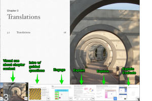
Here is what the majority of my chapters end up looking like:
Chapter title page: High quality image that hopefully hints at the topic of the chapter.
Intro page: Including graphics and guided questions or lesson targets- students should be able to answer these questions by the end of the chapter.
Warm-up page: (not seen here) 4-5 questions that activate prior knowledge, math skills, etc, that will be needed in this chapter.
Engage: typically a question or interactive to lead them into the content.
Explore: more inquiry based learning for students to try and formulate an understanding of the concept instead of just being told the concept.
Explain: Text, images, example problems (some interactive some not), and video solutions. All these are used to drive the concepts home, help solidify the conceptions and redirect any misconceptions.
Extend: (not seen here) a time to apply the concept taught at a higher level of thinking. More than just a one step problem. Could include many forms of student driven content creation.
Evaluate: Simple reviews purposed for the students own benefit. Either affirming that understand the content or that they need to go back and review the explore and explain pages.
STRUCTURE
Related to the flow of an elearning experience (in this case an iBook) is its structure. The structure deals more with the layout of each page where as flow deals more with the content on the pages.
Structure is important in building trust with the end user. If the user understands the structure of the page then it will be easy for the reader to navigate and more energy can go into understanding the content as opposed to trying to figure out the navigation of the page.
This is where choosing to author in portrait or landscape becomes more of a decision for the author. With iBooks Author you can choose to author in both, leveraging the ability of the iPad to rotate and shift media to the left margin and viewed as thumbnails.
As for me I prefer to author in landscape. However, I am totally intrigued by the portrait concept of the left hand margin.
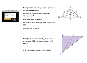
So, for many of my books I have decided on using a landscape orientation with two columns. The left column is set at 180px and the right is set at 700px. With the built in gutter spacing this makes for a left column of 216px which is just enough space for a thumbnail video.
Adding in the divider I believe helps students focus on the main column of content and use the left column as a reference for the current page.
One thing I have learned early on in writing interactive multi-touch books is that you’re never going to get it right the first time you do it.
I won’t claim to be doing everything right. In fact, I am probably still doing more wrong than right. I guess I write this to say it’s constantly changing. I am constantly looking for new and better methods of making the user experience better and getting them into the flow.


Excellent post Tony — it gave me quite a bit to think about in terms of some upcoming books I am doing about math and Augmented Reality.
Glad these thoughts could help. Can’t wait to read about your thoughts on augmented reality and math! Let me know when they are available.
Here is the first free AR MATH book
On algebra 1 and algebra 2 more to come over break
https://itunes.apple.com/us/book/augmented-reality-used-in/id741845597?mt=11
Reblogged this on mrspepedotcom.
Also, where can I find your books in the iTunes Store? I tried searching under your name but nothing came up.
Hey Courtney, all my books are hosted on my iTunes U course for now. Hope to release them to the iBook Store in the near future. You can find my courses here: https://itunes.apple.com/us/course/open-geometry-1st-semester/id561693440
Thank-You
Cool stuff, Tony!
Thanks Michael,
I had no idea Trans-eye was located in Michigan. Great to know there are highly qualified instructional designers nearby. Hope to cross paths someday.